Grow Therapy. Grow Forward 2026 summit branding
An annual one-day conference which drew over 140 mental health providers from across the United States to The Lane, a harbor‑side venue in San Diego.
41% of attendees travelled from out of state, and the event grew 63% year on year. Providers rated the day 94% CSAT with an NPS of 88. People show up when they feel something was built for them.
I was brought in to design the summit from the ground up — three microsites built in Figma, a full suite of large‑format environmental graphics, 80+ branded deliverables across digital and physical. Alongside the physical environment, I designed all of the branded presentation decks shown on screen throughout the day — speaker slides, talking points, charts, testimonials, and templates used across six different sessions. From the first flag attendees saw walking into the venue to the multiple take home pieces. Every detail was intentional.
Microsites
Three versions of the site were designed in Figma across two phases, expanding as the event took shape, from a save‑the‑date landing page in December to a five‑page microsite by April.
The final site covered Home, Venue, Agenda, Speakers, and a new Continuing Education page added for 2026. I worked within Grow Therapy’s existing brand system, extending and repurposing assets so the summit felt like a natural extension of the main brand rather than a standalone event.
Once each version was approved, I handed off detailed Figma files and worked directly with Grow Therapy’s web developers to bring the designs to life right here!
41% of attendees travelled from out of state, and the event grew 63% year on year. Providers rated the day 94% CSAT with an NPS of 88. People show up when they feel something was built for them.
I was brought in to design the summit from the ground up — three microsites built in Figma, a full suite of large‑format environmental graphics, 80+ branded deliverables across digital and physical. Alongside the physical environment, I designed all of the branded presentation decks shown on screen throughout the day — speaker slides, talking points, charts, testimonials, and templates used across six different sessions. From the first flag attendees saw walking into the venue to the multiple take home pieces. Every detail was intentional.
Microsites
Three versions of the site were designed in Figma across two phases, expanding as the event took shape, from a save‑the‑date landing page in December to a five‑page microsite by April.
The final site covered Home, Venue, Agenda, Speakers, and a new Continuing Education page added for 2026. I worked within Grow Therapy’s existing brand system, extending and repurposing assets so the summit felt like a natural extension of the main brand rather than a standalone event.
Once each version was approved, I handed off detailed Figma files and worked directly with Grow Therapy’s web developers to bring the designs to life right here!
AI photoshoot
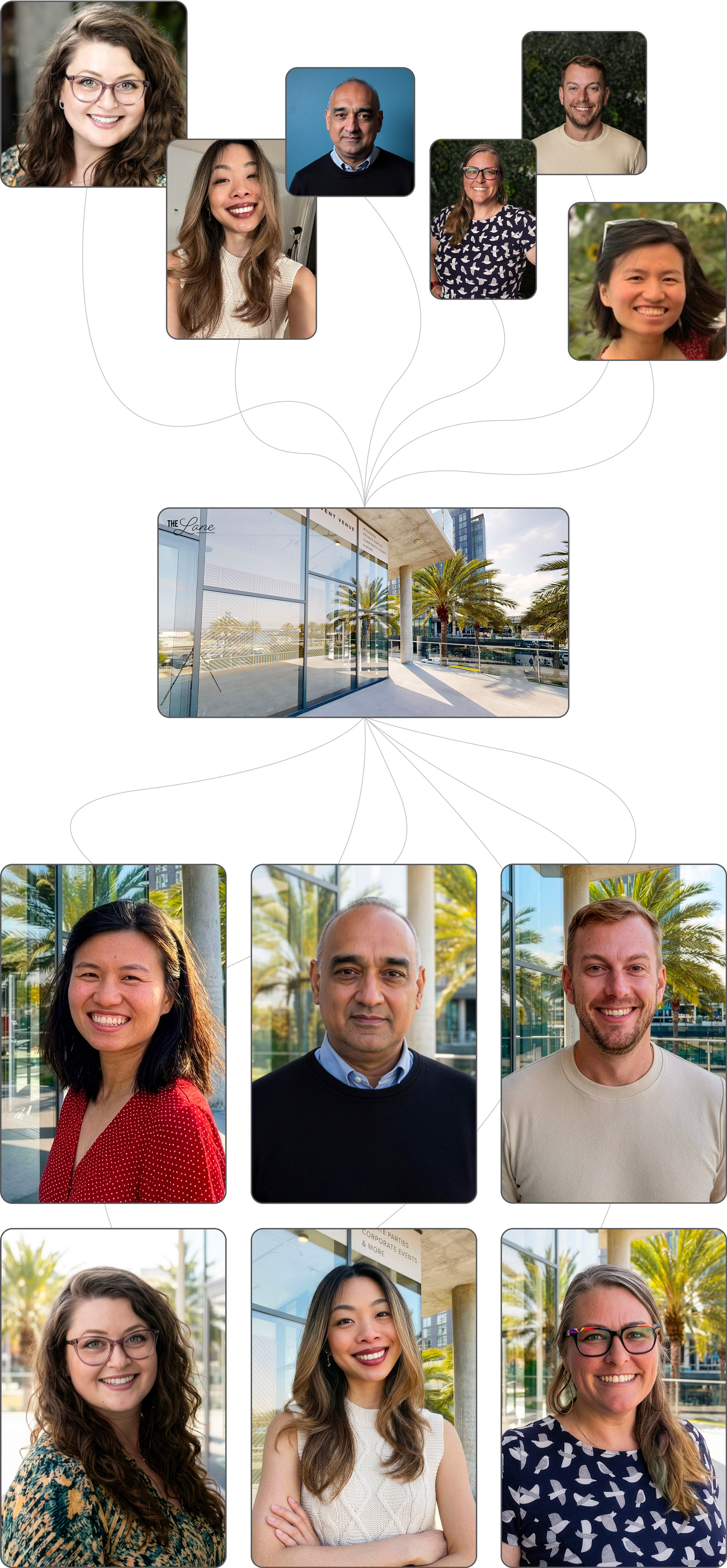
The speaker page presented an early problem: 13 vastly different headshots were supplied: different backgrounds, camera settings, inconsistent lighting, poses and quality, one was just a low res facebook profile pic, and even the technically good shots weren’t cohesive.
A reshoot wasn’t an option so I utilized Nano Banana via Flora.ai to create a virtual photoshoot, placing each speaker into a consistent environment, namely the actual venue where the summit would take place. The result looked like it came from a single cohesive shoot, and was one of many decisions that added up to give the summit an elevated and consistent look.
Notepad
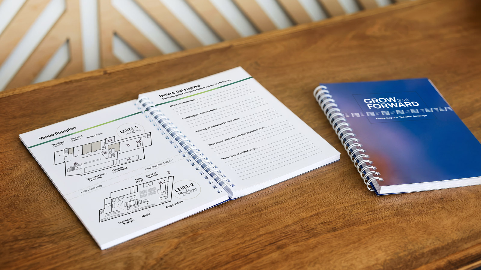
A 104-page branded notebook, given to attendees. Included were event details, self care exercises, event resources, engagement prompts, and a Grow guide for clinicians.
I created an illustrated guide to The Lane designed in the style of a museum map, and also a tourist map of San Diego which I’d suggested as a value‑add for attendees who had flown into San Diego for the weekend, essentially as tourists.
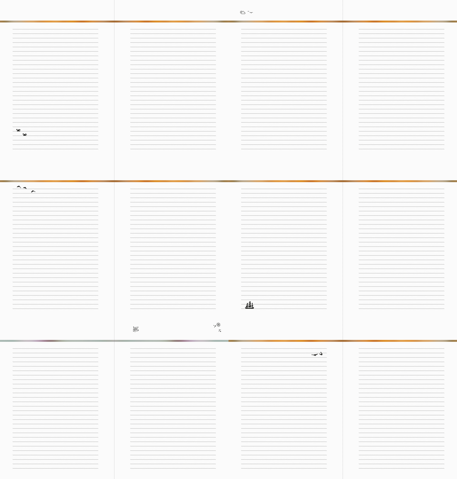
I applied a wavy line on all notes pages, matching the sub‑brand motif carried throughout all summit communications. On every fourth notes page I added a tiny illustration that interacted with the wavy line: marine life, landmarks, and activities from San Diego bay. Dolphins, pelicans, turtles, a lighthouse, a tall ship, cyclists, kayakers, kite surfers, July 4th fireworks. Small enough to feel like a discovery rather than a decoration. The InDesign document was built on a strict baseline grid with paragraph styles and master pages etc. for consistency and efficiency.

Flags
The first Grow Forward branded communication attendees encountered on the day. In the weeks prior they encountered the brand through the event microsite and emails but this was the moment the brand became real, a signal that said “yes, this is the place, and it’s going to be worth it.”
I pushed the typography into experimental territory, oversized, almost abstract, outlined letterforms that technically shouldn’t have worked at scale. The logo, reversed out of a full‑width white bar is the smallest element on the flag, but it’s where your eye is drawn to, hierarchy through contrast, not size. The purple, lilac, blue, and magenta gradient that runs through all the summit materials grounds it in the brand.
This typographic approach was carried through to the window vinyls, step‑and‑repeat backdrop, and pillar wraps, creating a family of large‑format pieces that feel like they belong together without being one‑note.

“One-way-vision” window vinyls
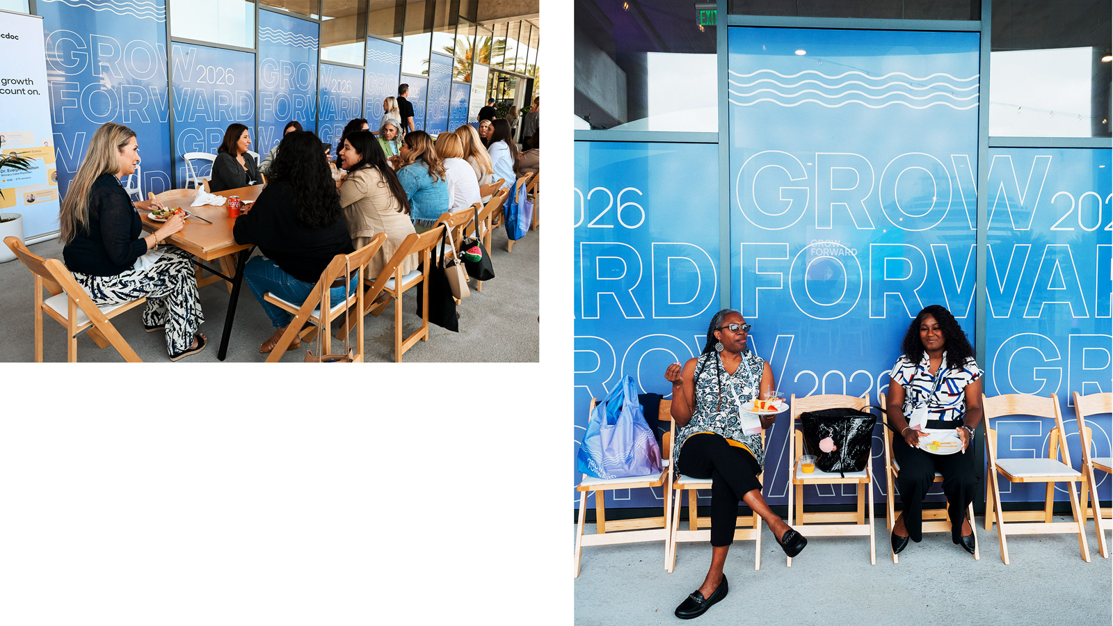
The venue sat directly on the harbor with floor‑to‑ceiling windows up to nine feet tall, providing a stunning view of the marina. These windows were set to be completely blocked by full coverage, opaque window vinyls. To counteract this, I pushed for one‑way vision stickers – opaque from the outside, transparent from within. This was an ingenious invention I had great success with when applied to restaurant windows in the past. At the event, everyone inside kept their view of the marina and there was no psychological divide between what was happening outside versus inside.
This decision was an invisible value‑add, which greatly enhanced attendees' experience. The tall and shorter versions were designed to seamlessly tile and give the illusion of being a fully expansive design rather than just two designs repeating.
Main event stage
The centerpiece utilized SEG (Silicone Edge Graphics), a high‑resolution dye‑sublimated fabric print with a thin silicone strip sewn around the edges.
This was one of the most important pieces, every speaker stood in front of it, every stage photo had it in the background. It needed to be minimal yet reinforce the established branding, complementing the speakers without visually overpowering them.
I worked through multiple directions with Creative Director Katie O’Keefe, exploring gradient backgrounds, horizontal wave patterns, and various logo placement. The final design is clean, and deliberately restrained. Logo positioned top left rather than centred so it reads clearly in photographs without dominating the speaker. The wave motif used sparingly, present enough to connect to the broader identity, subtle enough not to distract.
The centerpiece utilized SEG (Silicone Edge Graphics), a high‑resolution dye‑sublimated fabric print with a thin silicone strip sewn around the edges.
This was one of the most important pieces, every speaker stood in front of it, every stage photo had it in the background. It needed to be minimal yet reinforce the established branding, complementing the speakers without visually overpowering them.
I worked through multiple directions with Creative Director Katie O’Keefe, exploring gradient backgrounds, horizontal wave patterns, and various logo placement. The final design is clean, and deliberately restrained. Logo positioned top left rather than centred so it reads clearly in photographs without dominating the speaker. The wave motif used sparingly, present enough to connect to the broader identity, subtle enough not to distract.

Step & repeat and photo props
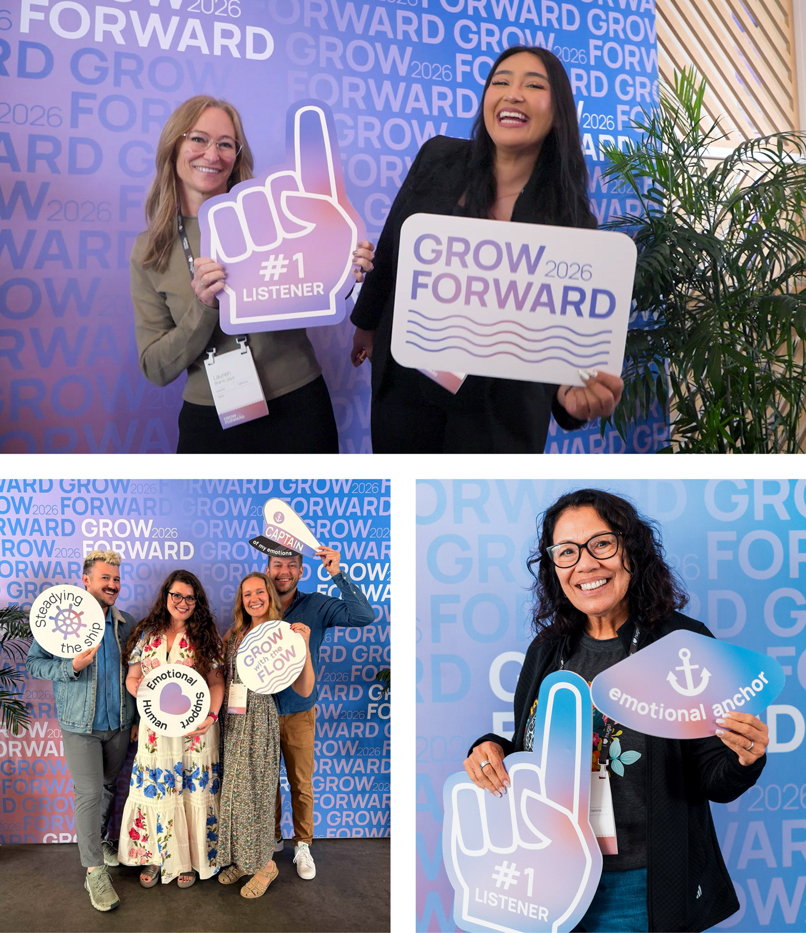
Where people gathered to take photos, and mark that they’d been there. The design uses the same typographic tile pattern from the window vinyls and pillar wraps. In photos it reads immediately as Grow Forward without overpowering the people in‑shot.
To complement the center‑piece photo opportunity we produced photo props for attendees to pose with. The original brief suggested palm trees, waves, a logo sign. I thought we could push things further.
With some AI‑assisted ideation, that I then shaped and edited, the final set leaned into nautical puns with a therapy twist: “Steadying the ship”, “Captain of my emotions”, “#1 listener”, “Emotional anchor”, “Take a breather”, “Grow with the flow”, and “Self love summer”. Each prop was designed to its own shape – a foam finger, a captain’s hat, an anchor, a ship’s wheel. Nine props in total, all carrying the summit’s gradient palette and brand fonts.
Where people gathered to take photos, and mark that they’d been there. The design uses the same typographic tile pattern from the window vinyls and pillar wraps. In photos it reads immediately as Grow Forward without overpowering the people in‑shot.
To complement the center‑piece photo opportunity we produced photo props for attendees to pose with. The original brief suggested palm trees, waves, a logo sign. I thought we could push things further.
With some AI‑assisted ideation, that I then shaped and edited, the final set leaned into nautical puns with a therapy twist: “Steadying the ship”, “Captain of my emotions”, “#1 listener”, “Emotional anchor”, “Take a breather”, “Grow with the flow”, and “Self love summer”. Each prop was designed to its own shape – a foam finger, a captain’s hat, an anchor, a ship’s wheel. Nine props in total, all carrying the summit’s gradient palette and brand fonts.
Lanyards and nametags
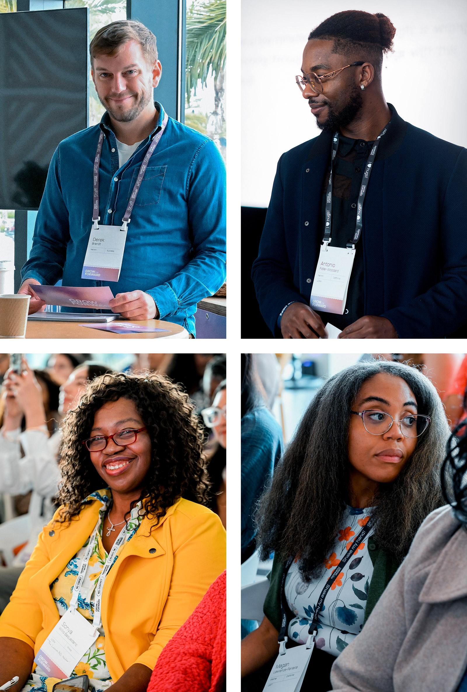
The nametags were produced at scale using data merge, hundreds of variations accommodating long and short names, multiple credential formats, pronouns, and states of origin, all within a single templated design system.
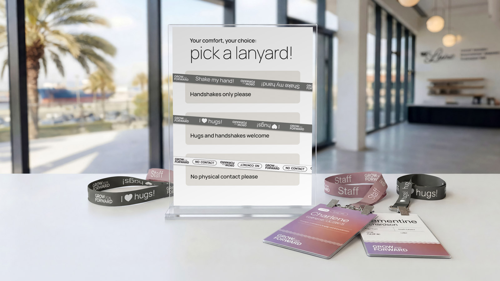
Lanyards seem like a minor detail until you’re in a room with 200 people and nobody knows who they can hug; just shake hands with; or who prefers no physical contact. I proposed a four-category system: mauve for staff; white for attendees who preferred no contact, with “No Contact” enclosed in a pill device for immediate visual clarity; and two charcoal variants for attendees open to physical contact: handshakes or hugs.
A little humor in the copy (“Shake my hand!” / “I ♥ hugs”) made the system feel human rather than clinical. The heart icon was a quick, unmissable visual shorthand that differentiated the two charcoal lanyards.
The nametags were produced at scale using data merge, hundreds of variations accommodating long and short names, multiple credential formats, pronouns, and states of origin, all within a single templated design system.
Lanyards seem like a minor detail until you’re in a room with 200 people and nobody knows who they can hug; just shake hands with; or who prefers no physical contact. I proposed a four-category system: mauve for staff; white for attendees who preferred no contact, with “No Contact” enclosed in a pill device for immediate visual clarity; and two charcoal variants for attendees open to physical contact: handshakes or hugs.
A little humor in the copy (“Shake my hand!” / “I ♥ hugs”) made the system feel human rather than clinical. The heart icon was a quick, unmissable visual shorthand that differentiated the two charcoal lanyards.

App icon and download table top
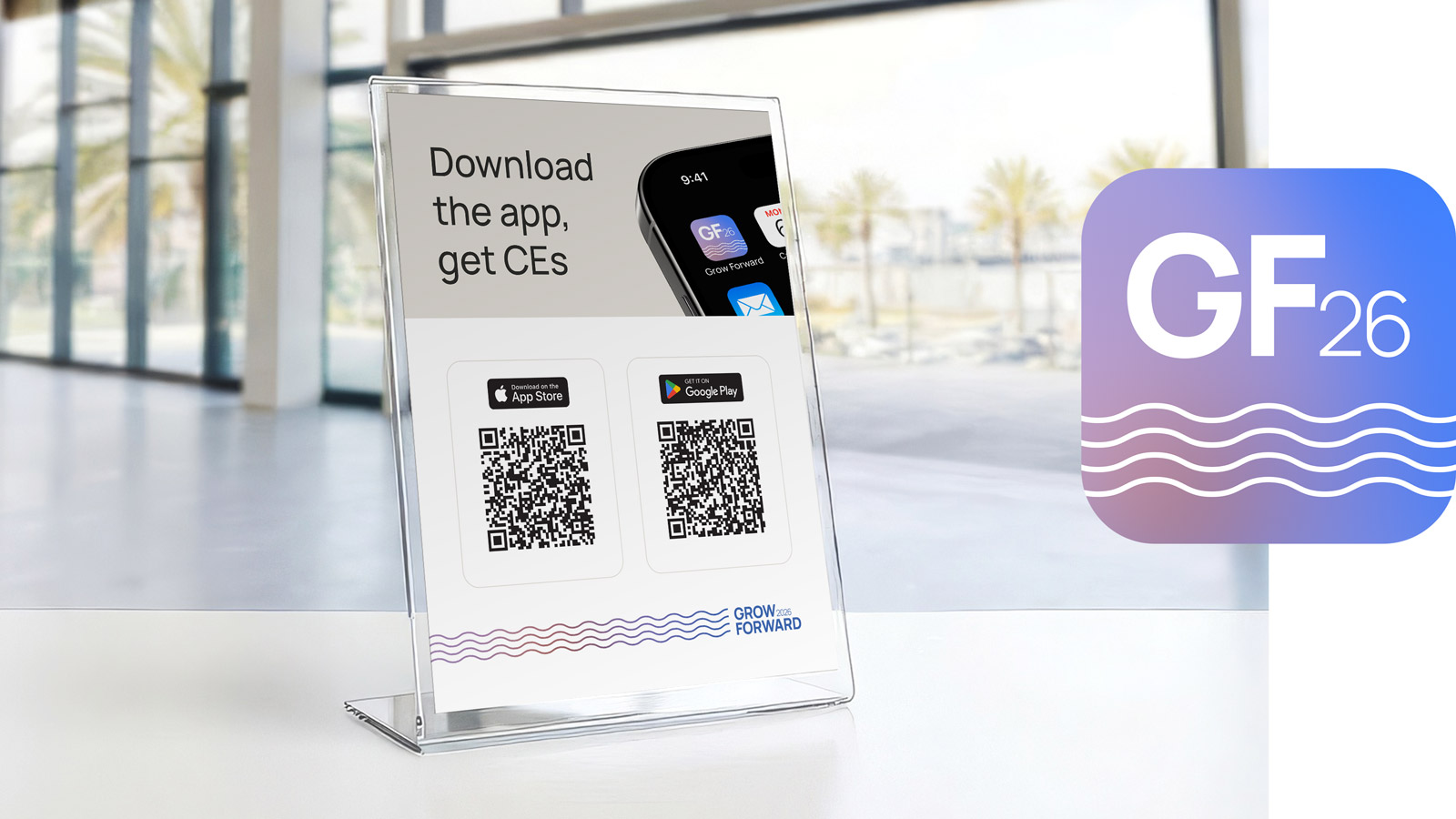
Featuring the summit app icon I had designed earlier in the project then applied to a phone mockup. I created an 8.5 x 11 card encouraging attendees to download the summit app. The card was displayed in a clear acrylic table stand, with QR codes for both App Store and Google Play downloads.
Featuring the summit app icon I had designed earlier in the project then applied to a phone mockup. I created an 8.5 x 11 card encouraging attendees to download the summit app. The card was displayed in a clear acrylic table stand, with QR codes for both App Store and Google Play downloads.
On‑site printed hand outs
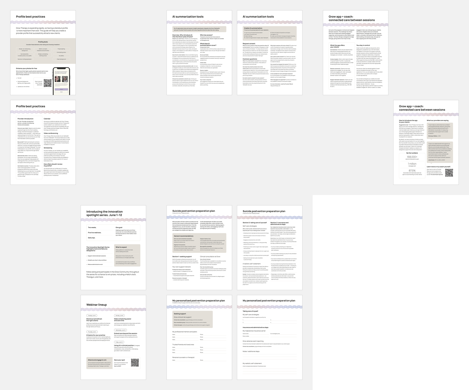
Five double‑sided handouts given to summit attendees, covering: Profile best practices, AI summarisation tools, Grow app and coach, The innovation spotlight series, and a Suicide postvention preparation plan.
All five documents were designed on a universal baseline grid with consistent paragraph and character styles, ensuring they read as a coherent set despite there being different content structures and lengths.
Five double‑sided handouts given to summit attendees, covering: Profile best practices, AI summarisation tools, Grow app and coach, The innovation spotlight series, and a Suicide postvention preparation plan.
All five documents were designed on a universal baseline grid with consistent paragraph and character styles, ensuring they read as a coherent set despite there being different content structures and lengths.
My roles:
Design
Concept
Figma page layout
Event Photography: Nicole Gengaro
Event Video: Bill Antonucci
AI-generated environment mockups were used throughout for in‑situ visualisation of branded collateral at scale.
Design
Concept
Figma page layout
Event Photography: Nicole Gengaro
Event Video: Bill Antonucci
AI-generated environment mockups were used throughout for in‑situ visualisation of branded collateral at scale.