Shucks Maine Lobster, brand identity
Shucks Maine Lobster has been sourcing and supplying wild-caught Maine lobster since 2006. The brief called for a logo, product labels, packaging, and business cards across three distinct directions.
After presenting the three directions the clients were unable to decide between concept 1 and 2 so I suggested they sleep on it and see which one was most easily recalled over the next 24 hours, whichever concept stuck in their minds would also be the most memorable for their customers.
After presenting the three directions the clients were unable to decide between concept 1 and 2 so I suggested they sleep on it and see which one was most easily recalled over the next 24 hours, whichever concept stuck in their minds would also be the most memorable for their customers.
Option 1 — The chosen direction
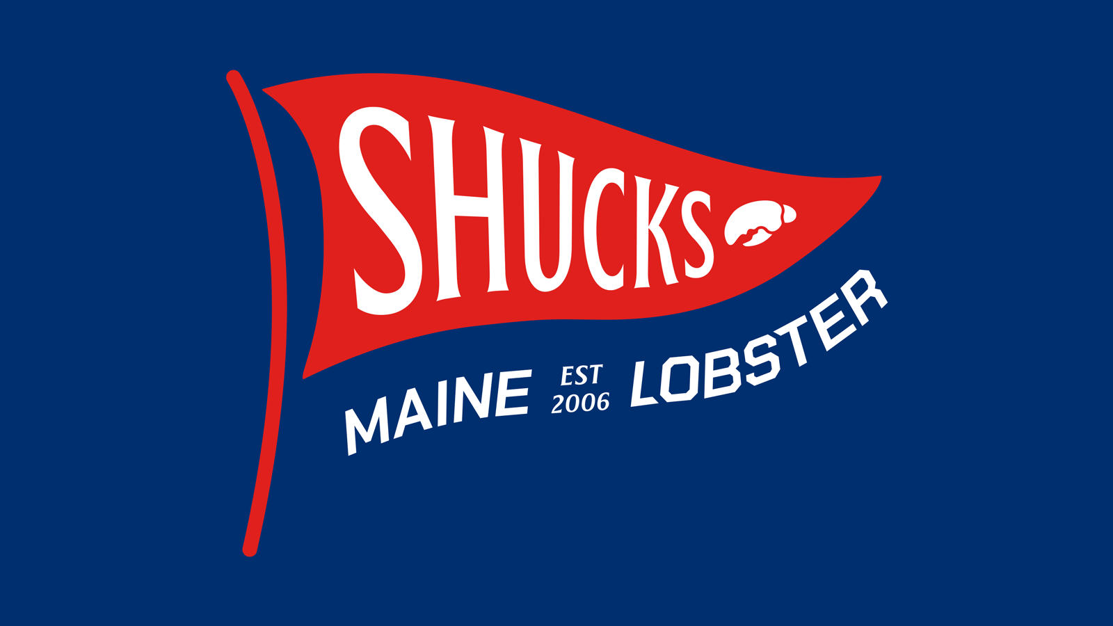
The logo is a triangular pennant flag — synonymous with maritime life and New England coastal culture. The crusher claw fills the narrow tip of the flag, tucked in neatly. Triangular flags are synonymous with maritime heritage, boat nationality identifiers, and signal flags for communication between ships.
A wavy line runs through the broader identity as a recurring brand element — mimicking the curve of the flag’s trailing edge and serving as a subtle nod to the water. “Est. 2006” is worked into the full lockup, reinforcing nearly two decades of expertise and trust.
The logo is a triangular pennant flag — synonymous with maritime life and New England coastal culture. The crusher claw fills the narrow tip of the flag, tucked in neatly. Triangular flags are synonymous with maritime heritage, boat nationality identifiers, and signal flags for communication between ships.
A wavy line runs through the broader identity as a recurring brand element — mimicking the curve of the flag’s trailing edge and serving as a subtle nod to the water. “Est. 2006” is worked into the full lockup, reinforcing nearly two decades of expertise and trust.
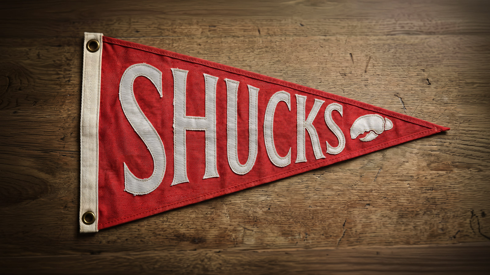
Boat flag
To sell the concept effectively, I visualized the logo as an actual cloth pennant flag — the kind that could fly from Shucks’ boats, hang in their office, or make an impression when gifted at a meeting. The AI‑generated mockup placed the design on weathered wood, stitched fabric, with brass grommets. Turning a theoretical logo concept into a tangible object.
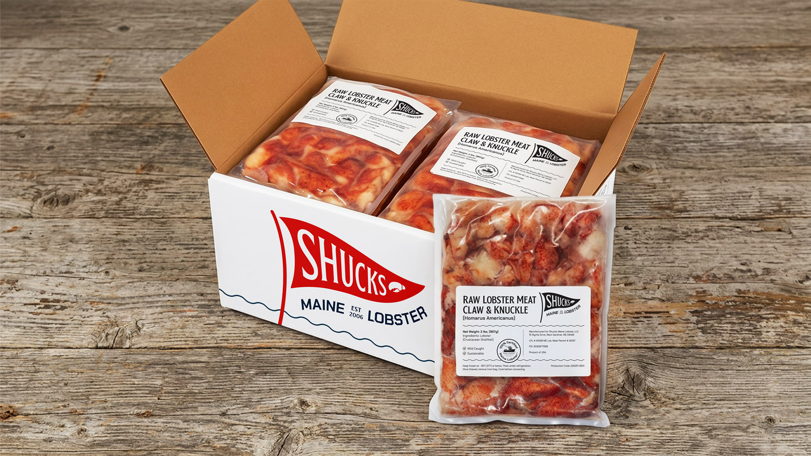
Packaging and product labels
Shucks were shipping product in unbranded corrugated boxes, missing a clear opportunity. I proposed the branded box as a value-add across the three concepts.
Shucks have trademarked the phrase “100% Certified Maine Lobster”, a significant trust signal they weren’t using enough, and had never visualized. I designed a concept specific version of the seal for each of the three directions. The labels themselves carry real regulatory information: weight, ingredients, lot numbers, storage instructions. Information-dense design work that needed to feel on-brand.
Business cards
The reverse of the card utilizes a duotone photograph of lobster pots stacked on a pier at dusk. With the same fonts as the logo. The wavy line motif carried through to the reverse.

Brand guidelines
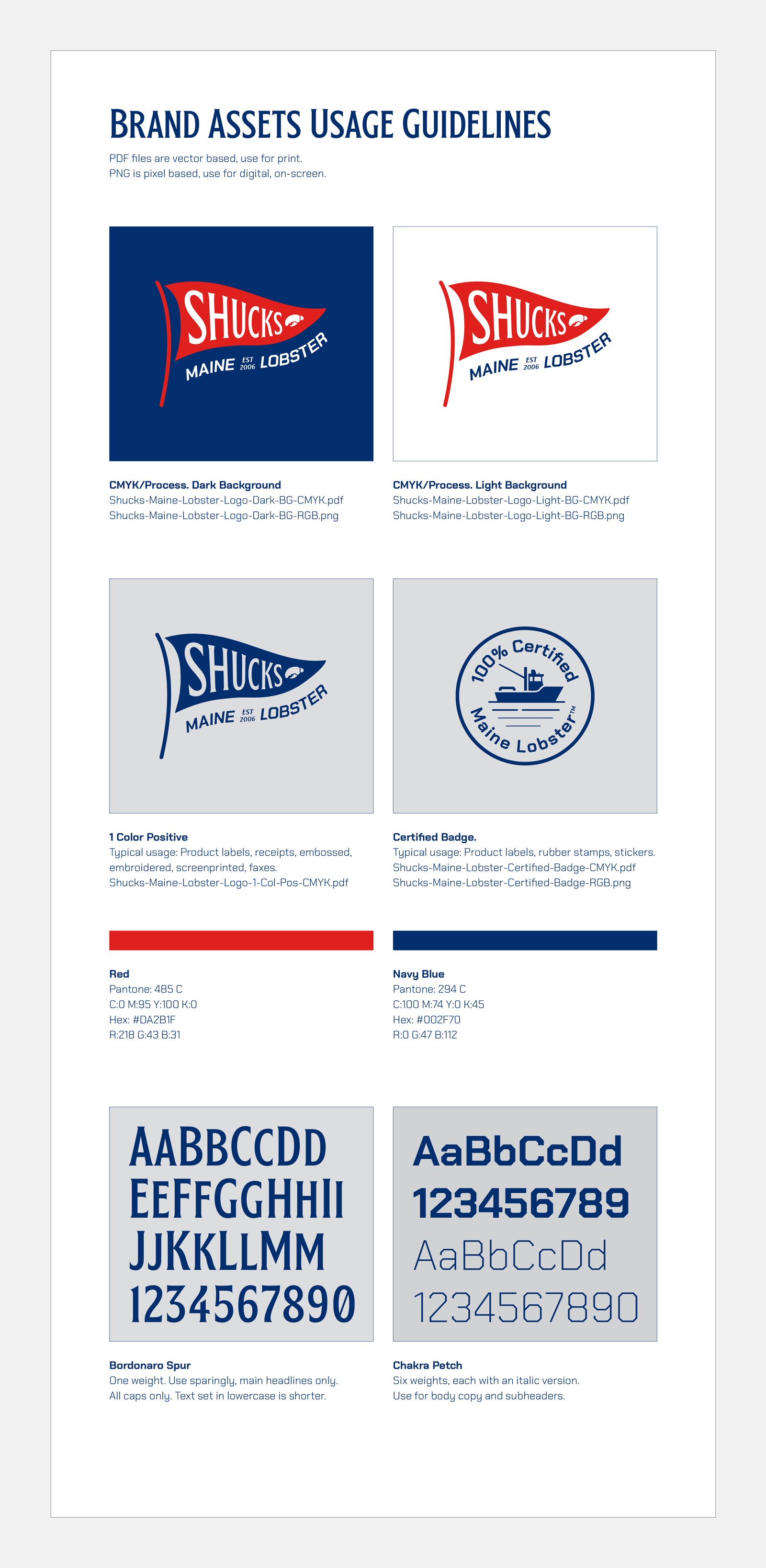
Brand building blocks were supplied for the client’s ongoing use: logo files for use in all required formats and applications, plus Pantone, CMYK, hex and RGB color breakdowns, typeface specifications and usage rules, and the redrawn “100% Certified Maine Lobster” seal. Clear guidance on which file to use where and when.
Option 2
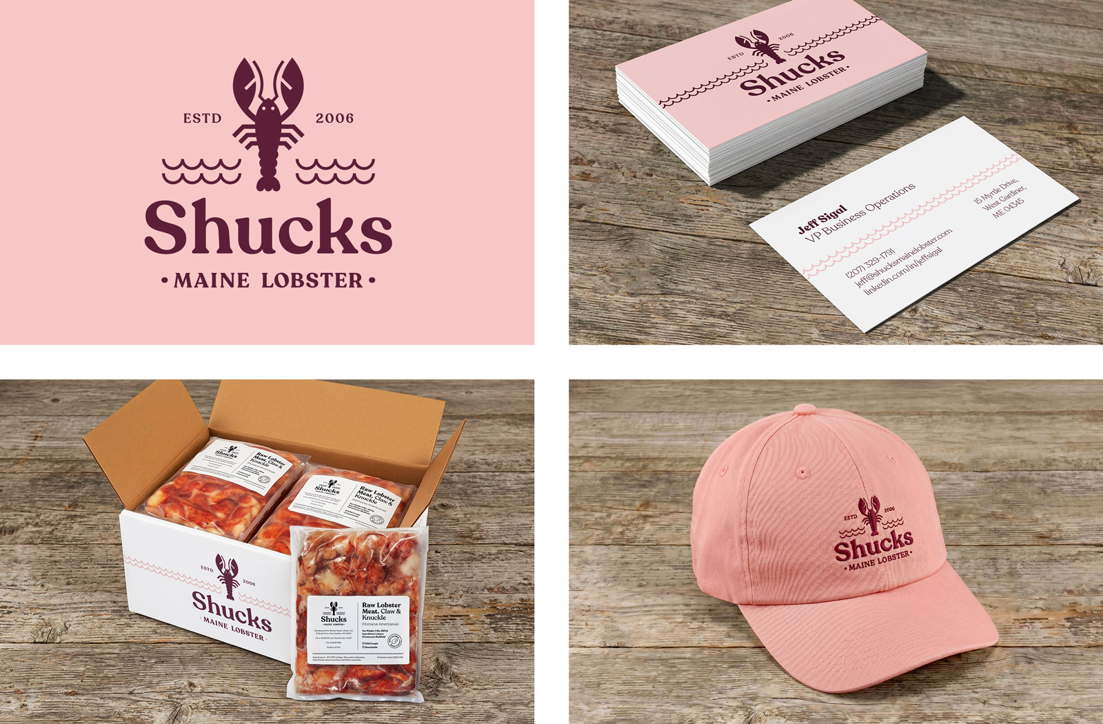
A more illustrative direction built around a hand‑drawn lobster icon, set against a warm pink with deep maroon — a softer, more contemporary take on the New England palette, and of course, the colors of lobster shells and meat. Two wavy lines wrap the identity as a recurring graphic device, inspired by, and meant to function like, the Adidas three stripes: a simple motif that becomes recognizable across applications.
A more illustrative direction built around a hand‑drawn lobster icon, set against a warm pink with deep maroon — a softer, more contemporary take on the New England palette, and of course, the colors of lobster shells and meat. Two wavy lines wrap the identity as a recurring graphic device, inspired by, and meant to function like, the Adidas three stripes: a simple motif that becomes recognizable across applications.
Option 3
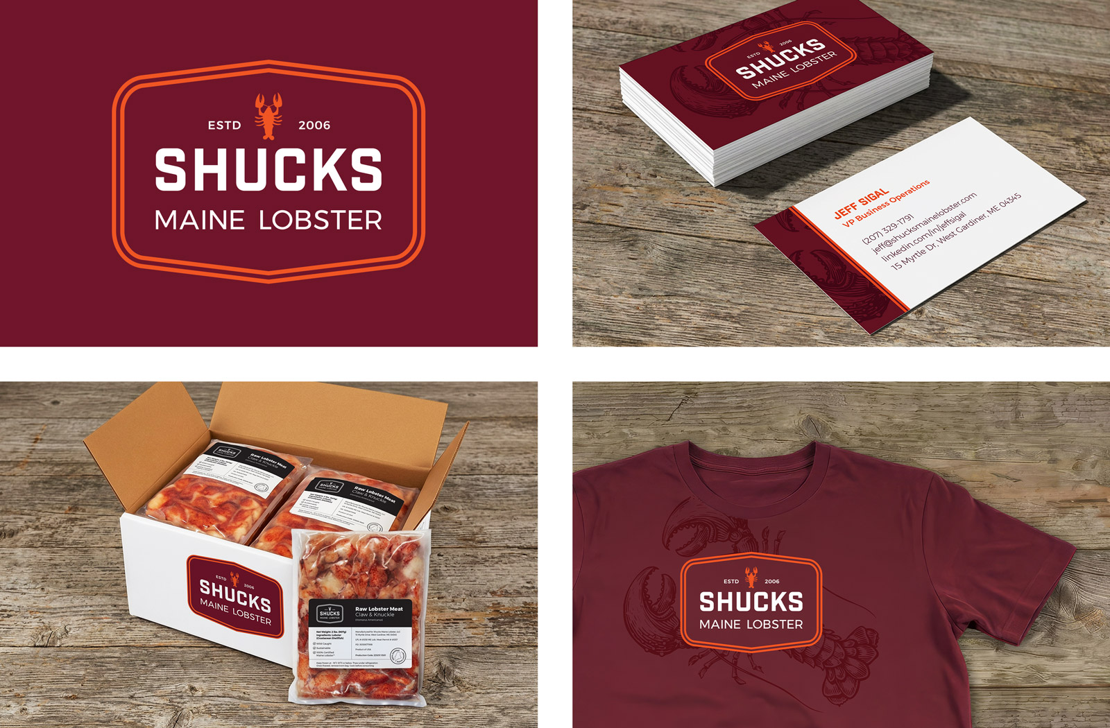
A badge‑format logo in deep maroon and orange, with a vintage lobster engraving used as a tonal element. Maroon on maroon, printed beneath the wordmark on the T‑shirt and business card. The arched shape at the top of the badge mimics the shape of a lobster boat’s transom. The engraving itself was a found piece of copyright‑free antique artwork; the kind of image that carries decades of authenticity without needing to manufacture it.
A badge‑format logo in deep maroon and orange, with a vintage lobster engraving used as a tonal element. Maroon on maroon, printed beneath the wordmark on the T‑shirt and business card. The arched shape at the top of the badge mimics the shape of a lobster boat’s transom. The engraving itself was a found piece of copyright‑free antique artwork; the kind of image that carries decades of authenticity without needing to manufacture it.
My roles:
Concept
Logo design
Packaging design
Product label design
Business card design
Brand guidelines
Client liaison
AI‑generated environment mockups were used throughout for in‑situ visualisation of branded collateral.
Concept
Logo design
Packaging design
Product label design
Business card design
Brand guidelines
Client liaison
AI‑generated environment mockups were used throughout for in‑situ visualisation of branded collateral.